- handles ledger-specific program id as url params
- easy transformation of resulting data
- built-in selection tool for program data
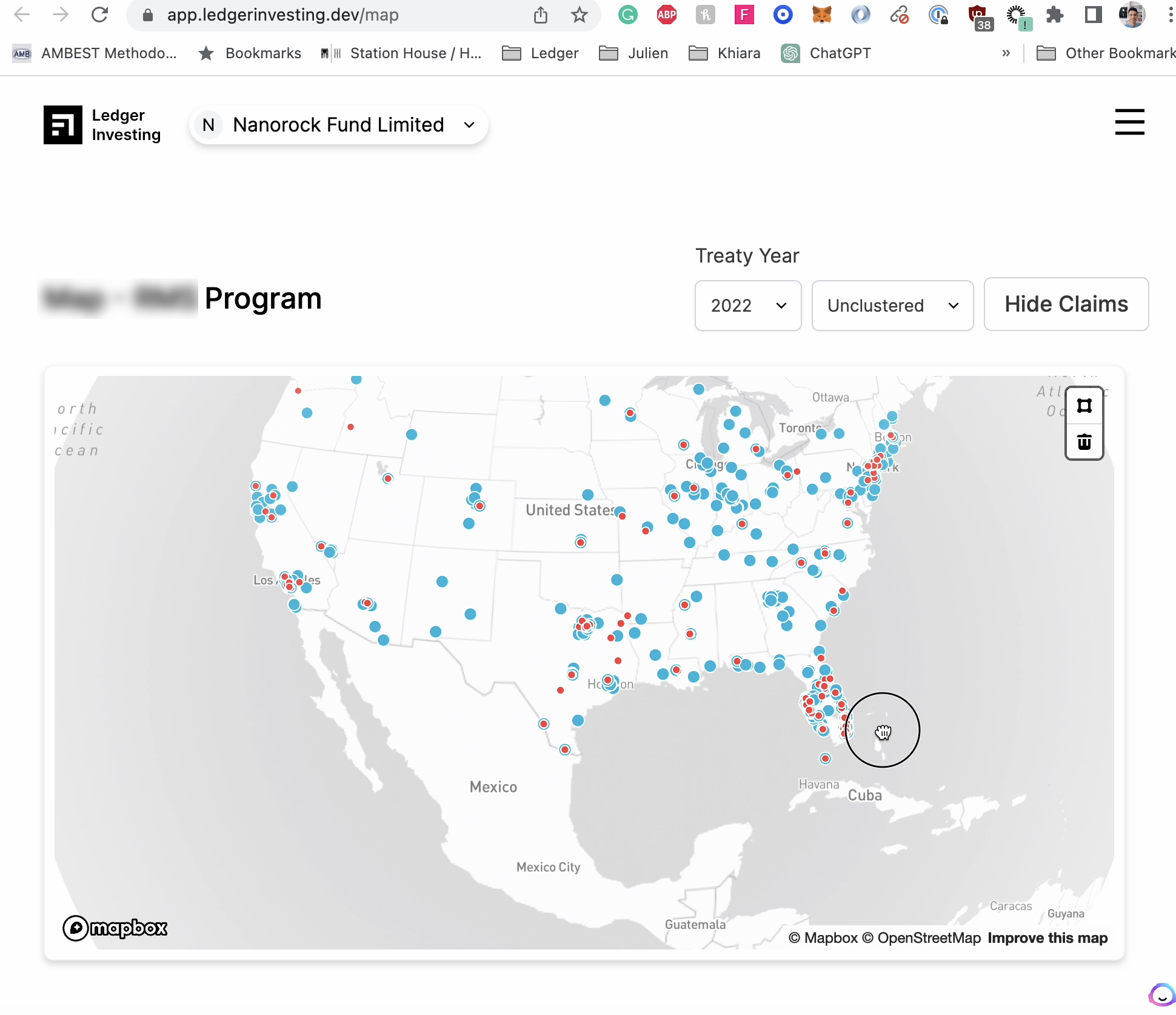
A map to visualize insurance data.
The map shows real transaction data, live, on-risk. We owe it to programs to give them a unique visual identity.
But this is more than a beautiful gimmick.
- The map shows policies at risk
- You can hover on any individual dot and display information about policies
- You can go back in time for a transaction and observe a snapshot of the past
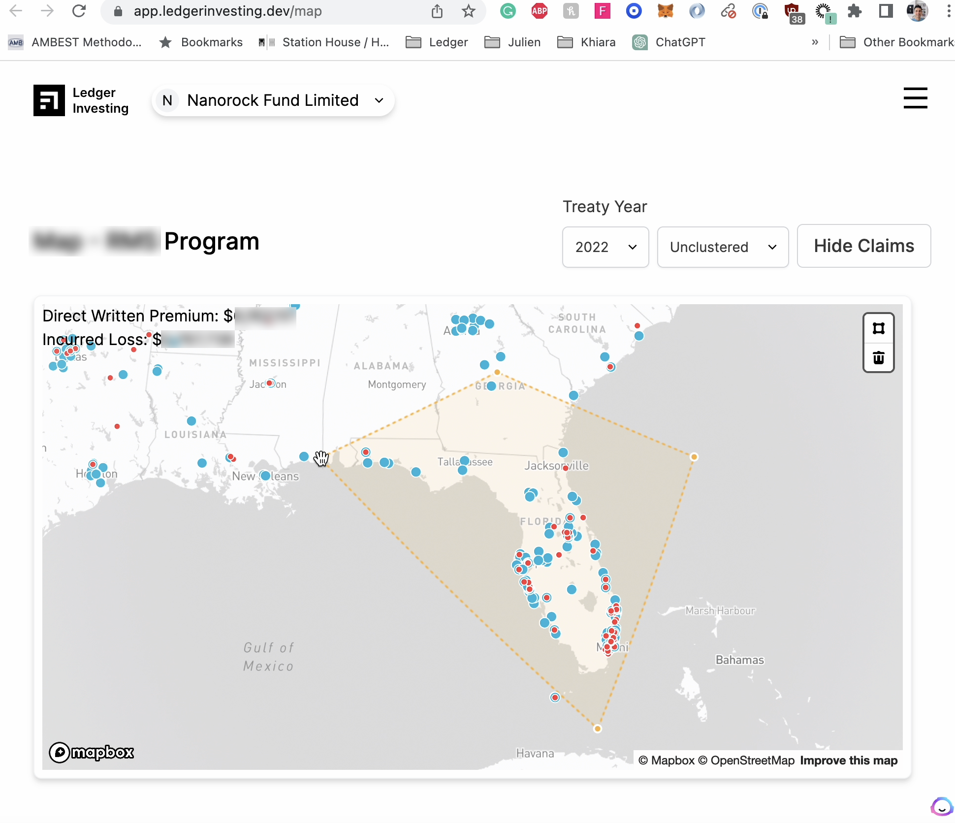
A polygon tool lets you select a subset of policies based on geo-data. It computes the sum of premium in that area. This is useful for quickly answering questions such as, "What % of the portfolio is in New York?"
The map also shows claim data live. This is useful for quickly answering questions such as, "Where are the losses located?", "Are there more policies in areas where claims are frequent?"
Multiple parties benefit:
- Insurers and MGAs gain insight on their own risks.
- The value for investors is intelligence. 2 programs in the same state and lines of business may have independant geographies. North/South, Cities/Suburbs.
- It's a visual interface for showcasing possible data inconsistencies. Clean geocoding will enable us to display 3rd party geo-datasets such as traffic, accident or weather.